Crafting Digital Stories: How Strategic...
September 10, 2024


In a world bombarded by information and stimuli, minimalist design offers a respite, a visual oasis that communicates powerfully without the clutter. Let’s delve into the world of minimalism in graphic design and understand why it continues to be a driving force in visual communication.

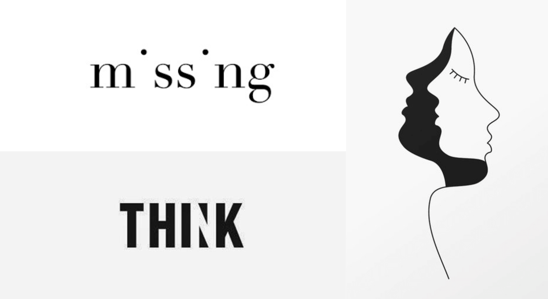
At its core, minimalism advocates for simplicity. In graphic design, this translates to the use of clean lines, basic shapes, and a restricted color palette. By eliminating unnecessary elements, a minimalist design allows the audience to focus on the core message without distraction. This simplicity not only enhances visual appeal but also aids in quicker comprehension. In a world where attention spans are increasingly shorter, the immediate impact of a minimalist design cannot be overstated.
Negative space, often referred to as white space, is the unmarked area in a design. In minimalism, this space is as crucial as the elements themselves. By allowing elements to breathe, designers create a sense of balance and harmony.
Minimalist designs often employ a limited color palette. This deliberate choice not only adds to the visual appeal but also enhances the overall coherence of the design. Colors, in minimalism, are used to evoke emotions and create specific associations. For instance, a combination of white and blue can convey a sense of calm and professionalism, while red might evoke passion and energy. By using a few carefully selected colors, a minimalist design communicates a message that is both powerful and memorable.
Typography in minimalist graphic design is characterized by clarity and functionality. Clean, sans-serif fonts dominate this style, enhancing readability and ensuring that the message is conveyed without unnecessary ornamentation. Every font choice is deliberate, aiming to create a visual hierarchy that guides the viewer’s attention. Whether it’s a sleek logo or a minimalist website, typography is a cornerstone of minimalist graphic design, ensuring that words don’t just speak but also resonate visually.
In the era of digital communication, minimalist graphic design has found new relevance. With the rise of mobile devices and social media, where screens are smaller and attention spans are shorter, minimalist designs stand out. Their simplicity ensures seamless adaptability across various platforms.
From mobile apps to websites, the principles of minimalism enhance user experience by offering intuitive navigation and uncluttered interfaces.

The Timeless Allure of Minimalism Minimalism in graphic design is more than just a design trend; it’s a fundamental shift in the way we perceive and interact with visual information. Its enduring appeal lies in its ability to convey complex messages with utter simplicity. In a world inundated with information, a minimalist design acts as a visual sigh of relief, allowing viewers to engage without feeling overwhelmed. It’s a reminder that in the realm of visual communication, less truly is more.
As we move forward, the influence of minimalism in graphic design is only expected to grow. Its principles will continue to shape how brands communicate, how websites are designed, and how art is perceived. By embracing the philosophy that simplicity is the ultimate sophistication, designers not only create visually appealing compositions but also ensure that their message is received loud and clear in a world that often drowns in the noise of excessive information.
Minimalism reminds us that amid complexity, there is beauty in simplicity, and in graphic design, this simplicity has the power to captivate, communicate, and leave a lasting impression.
Leave A Comment